Google sheets can remotely use it. Furthermore, because Google Sheets is accessible through the internet, there is no need to download the software. Google Sheets may be customized and used to organize a variety of data, among other things. Wherein, there is no requirement to have great skills related to google sheets to create line graphs. A line graph is a graphical representation of data with two consecutive lines on two axes connected to each other. It is mostly used to analyze data in a short amount of time and to provide a concise understanding of the data as well as clarity on the next step to be performed. Moreover, How To Make A Line Graph In Google Sheets details are provided below.
Steps To How To Make A Line Graph In Google Sheets?
- Internet Browser
- Firstly, open the internet browser as per your preference.
- Go to google.com
- Search Google Sheets
- Open the blank sheet or click on the “+” sign sheet.
- Data
- Enter the data as per your choice
- Then press Ctrl+A to pick the data..In this case, whole data will be selected.
In other words, you can also highlight data by dragging the mouse on the text.
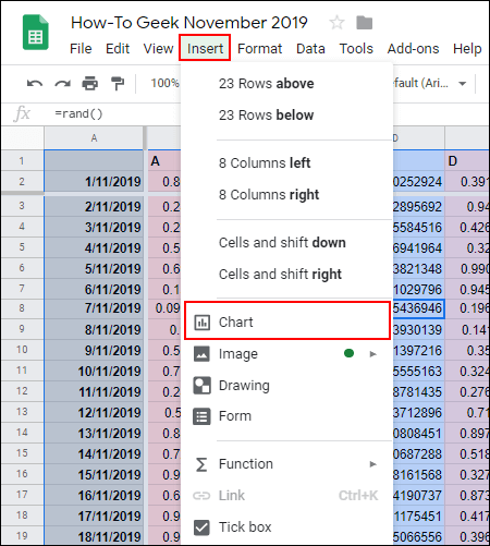
- Insert Option
- Click on the menu option
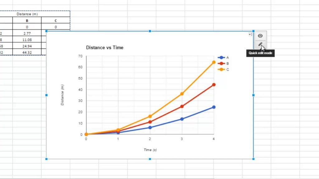
- Click on the chart option. Then select the line chart that best suits your needs.
- The line chart will automatically detect.
In case, you didn’t like the chart. Then you can customize it in the way you wish.
- Customized option
- Click on the charts
- Then three dots will appear on the above right corner.
- Click on the edit chart
- Chart Settings
- Open the editor panel
- From the drop-down option, choose Change Type
- Choose the right chart as per your preference
Line Graph Variations
- Regular Line Graph: It displays a single graph with two different variables shown on a single graph.
- Multiple Line Graph: It depicted lines on various variables changes.
- Compound Line Graph: Data proportion is established by several levels.
Advantages
- Easy understanding of data in a short time. Moreover, it saves time and gives a clear scenario to make a decision.
- It is feasible to understand and explain the data
- It is easy to compare previous and recent data
- The data is displayed in a numbers
- The information is summarised.
- It conserves time.
Purpose
- This is an excellent approach to highlight the differences in statistics of incline and decline of the data record
- Variations and development tendencies can be predicted. As compared to other types of graphs.
- The most effective way:
- There are main two elements connected to one another
- The progression of information
Characteristics
- Title
- This is a major feature of a line graph. A title is a word that tells the reader about the subject of the graph.
- Important points to keep in mind:
- The heading should be to the point
- Discussed clearly
- Eye-catchy heading
- Scale
- The scale should be based on the number of units. Moreover, each point should be discussed in details
- The important factor to keep in mind helps in the analysis of results by a third party. In some cases, data can be rather considerable.
- Points
Points help in identifying the value of every graph.
- Labels
Labels are used to identify which kind of data is represented in the graph. It is composed of two axes.
- X-axis: This represents the horizontal data
- Y-axis: It represents The vertical data
- Line
A line represents two adjoining lines. It essentially determines the estimated value between the points and the discredited value.
Conclusion
To sum up, a Line graph plays an important role in order to identify the difference between the previous and recent data. It helps an organization to make a decision. Moreover, Google sheets play a major role as anyone can access the data around the globe now as do variation as per the preferences. It helps to make decisions clearly without any second thought. In case the data is large or complicated with the help of google sheets it is feasible to identify.